
 85239 85239 |
 35211 35211 |
|
|
||
|
|
|||||||
| Welcome to the Exploding Garrmondo Weiner Interactive Swiss Army Penis. |
|
GFF is a community of gaming and music enthusiasts. We have a team of dedicated moderators, constant member-organized activities, and plenty of custom features, including our unique journal system. If this is your first visit, be sure to check out the FAQ or our GFWiki. You will have to register before you can post. Membership is completely free (and gets rid of the pesky advertisement unit underneath this message).
|
 |
|
|
Thread Tools |
Member 98 Level 35.79 Mar 2006 
|
Need advice on touching up photos
I've been tinkering around with my newest camera (a Canon A620), and I spent last week on a cruise ship, visiting some exotic islands like St Thomas. I took up a gig worth of shots, and they're all saved on my PC. I want to touch them up, but I'm still not sure what will bring out the best results. I have Photoshop, and the camera came with it's own editing program, but I could use your advice on what effects I could apply aside from tinkering with the brightness and contrast to bring out the best quality possible.
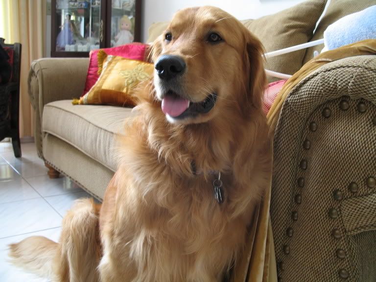
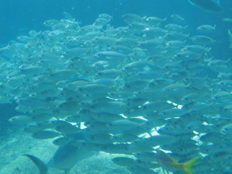
Here's a sample of the shots, each specific in the kind of photos I'm prone to taking (outdoors, fish life, dogs, etc). Spoiler:
Offer your suggestions, and feel free to post your edited versions of my pics. Jam it back in, in the dark. 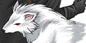
|
Member 541 Level 26.51 Mar 2006
|
Well, you can Level the image first, and then up the saturation. Don't overdo the saturation though.
Take a look. 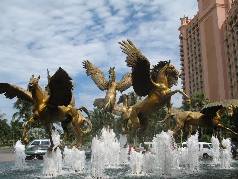  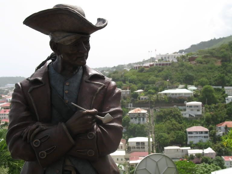 Okay, the green is kinda obnoxiouse 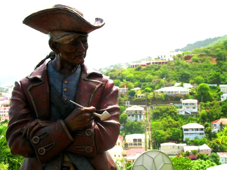 There's nowhere I can't reach. |
Member 98 Level 35.79 Mar 2006
|
Hmm, I dunno, the colors look a bit washed out. It works on the horses, but perhaps it needs to be lowered a bit.
This thing is sticky, and I don't like it. I don't appreciate it. |
Member 9557 Level 3.20 Jul 2006
|
I like the doggy and the dude's statue the most, they have a lil personality to 'em. The only thing I see wrong with the horses is a little pixelation on their bellies in the edit.
 One thing you wanna do is make sure that nothing is competing with the object of attention. The statue of that aristocrat (i think?) stands out a little more in the first, but in the edit the grass competes with it and the eye just decides to pull away from the image. I have a canon rebel xt, nice camera though better ones are out there yup yup, and the first thing to learn and dominate  is playing with the aperture and shutter speed of the camera, (if you can manually do it, then better). If you know about it you can freeze or blur moving objects, allow more or less light in to do so, etc... Also, getting the right angle and moment helps. I think the horse statue picture is pretty good, just wonder if it would have been better to freeze the water or blur it in motion, who knows. is playing with the aperture and shutter speed of the camera, (if you can manually do it, then better). If you know about it you can freeze or blur moving objects, allow more or less light in to do so, etc... Also, getting the right angle and moment helps. I think the horse statue picture is pretty good, just wonder if it would have been better to freeze the water or blur it in motion, who knows. Ooooooooooo! Do you know about clone stamping in photoshop? It's a sneaky lil technique you use to mask stuff up in pictures. Example!  Take your first picture and open in photoshop. Click on the clone stamp icon in the tools bar, or hotkey S. Hold "alt" and click on the part of the picture you wanna copy, then let go of alt and just "paint" with the stamp over the place to paste. Try it out with the sky and that building in the first if you want completely get rid of it. Just be careful with patterns. Take your first picture and open in photoshop. Click on the clone stamp icon in the tools bar, or hotkey S. Hold "alt" and click on the part of the picture you wanna copy, then let go of alt and just "paint" with the stamp over the place to paste. Try it out with the sky and that building in the first if you want completely get rid of it. Just be careful with patterns.The fish picture could have been a reeeeeally good example of a concept in design called irregularity in pattern, where that fish with yellow colors breaks the pattern of all the other blue fish. Just one thing, the golden rule or ratio sort of divides that image rectangle into about 4 parts, so that fish would be placed in the middle of one of those but a little closer to the middle of the whole thing.... hehe lots of design crap going on all the time  Well these are all just tidbits of info that you might know. Have fun most of all, yup yup. I am a dolphin, do you want me on your body? |
Member 98 Level 35.79 Mar 2006
|
And I aggree, the edit takes too much focus away from the statue, which should be the center of attention. Touching up just the statue while leaving everything else intact would be the way to go (not sure if there's a way to do that though).
I'm intrigued by the techniques you mentioned, but it would help a lot if you had pictures that serve as examples. I was speaking idiomatically.
|
Member 9557 Level 3.20 Jul 2006
|
Wow, I need more posts before posting URLs or images. ok...?
Anywho... For the horses you can use the dodge and burn tools in order to bring out the bright and dark colors. You can do the same with your pirate or you can go using the magnetic lasso tool and loop it around him, thus you'd only end up editing whatever's inside the lasso (him) and not outside Ok ok, I decided to show you an example using your pirate's picture! The first attachment is your original, and the second is my edit. Can you do me a favor and post both pics up in the thread since the background is dark? Thanks. First, I used the magnetic lasso tool and revolved it around the pirate. I adjusted the levels to increase the contrast because this is the figure of attention plus he's in the foreground. Then I saved the selection into a new channel so that I can just use the magic wand tool with that channel active, which lets me reselect the whole outline without having to redo the lasso thingy Ok, then I copied the layer and made a new one. I gave that new one a vector mask and I gaussian-blurred the top layer to about 2.7. Then I "erased" the pirate in that mask layer so that the blur wouldn't apply to the pirate. Then to further increase focus on the pirate, I reduced saturation on the top layer (which shows the background) to -47 or so. Then I wanted to touch up the pirate himself because he looked a little too dark. So I applied the dodge tool with a fuzzy brush to about 50% exposure on the highlights to bring out the "gold" in the buttons and the tendons on the bronze skin and such. Right now I'm just kinda concerned with the white sky (that's the issue now......... clone stamping! )However in the end... it's all up to your taste, babe What kind of toxic man-thing is happening now? Run doggy, run... :doggy:
|
|
Good Chocobo
Member 1774 Level 17.65 Mar 2006
|
Hm... Let's see where to start.
Well, let's go with the doggie first:
Next! The Fishes of Doom:
And last. Statue dude:
Oh, another thing I should mention is when altering the levels and Hue/Saturation, you should go to Layer --> New Layer Adjustment instead of Image --> Adjustment. This way your adjustments will be stored on a new layer so that you don't alter your original. Or you could just copy the original image and work on the copy... Yea that's about it. Pardon the lengthiness. FELIPE NO
Last edited by Kazyl; Jul 13, 2006 at 05:56 AM.
|
Member 929 Level 33.83 Mar 2006
|
That's one long-ass informative post. This is very useful, thanks man.
What, you don't want my bikini-clad body? |
|
Good Chocobo
Member 1774 Level 17.65 Mar 2006
|
Oh, just to add something to Silver Ogre's entry about aperture:
In addition to stopping motion (well it's more shutter speed related but shutter speed and aperture are both interrelated), aperture can bring more focus to your subject. Here's an example of a wide aperture (or f/stop, same thing) vs. a narrow aperture:  The top is a wide aperture of about 1.4. Notice that point of focus (the tripod) is sharp while the surrounding background is rather blurry. Now compare it to the second photo which had a narrow aperture of about 16. The subject is in focus and the background is clearer. Good for like portraits and junk. This effect can be replicated in Photoshop but I feel it’s too contrived. There’s a blur option in CS that’s supposed to imitate this but I don’t have CS :p. [edit]Ok, I looked at your manual and on page 50 They talk about aperture and shutter speed. Refer to that if you feel bold enough to manually set those. Jam it back in, in the dark.
Last edited by Kazyl; Jul 13, 2006 at 01:13 AM.
|
Member 9557 Level 3.20 Jul 2006
|
Yup! And once you go into this, you enter the world of lenses. In this case's example, a tele-lens (sp)... which you can use to get really cool zoom-in pictures of insects and whatnot.
One thing I do with such pictures, and others of course, is to try and play with color schemes to make everything more harmonious and can really juice up images. You can check articles online or in magazines about how to correctly play with aperture and shutter speeds to get the right image... whole worlds just about it really. There's nowhere I can't reach. Run doggy, run... :doggy:
|
Member 98 Level 35.79 Mar 2006
|
That is some fantastic work, Kazyl. I really appreciate the advice, and I'll be sure to practice on it so I can emulate your awesome touch-jobs.
This thing is sticky, and I don't like it. I don't appreciate it.
|
Member 1285 Level 26.51 Mar 2006
|
I really enjoy the pirate photo the most. One of my tips is to have taken it with a low aperture, preferably 1.4 if you have it or 2.8 is reasonable. The reasoning behind this is the same as Kazyl stated. Make the background blurry and keep the pirate in focus. It will really bring it out. You should do the same with your dog -- it will look less like a snapshot and more like an artsy photo.
Taking photos at different angles can help as well. For example, pay attention to backgrounds and such. For the pirate, I can see the back of a basketball hoop stand. That just looks terrible. An easy way to remedy this is to crop, but the problem is that you'll end up cutting off the arms. And the weather unfortunately cannot be helped, but an easy way of fixing that is to just insert your own in Photoshop or make the color of it bluer. You should also take the horses at a different angle as well. Those horses look like good photo subjects, but the people, cars, and hotel in the back are just plain snapshot-ty. What you could've done is crouch low beneath the statues and point the camera up to the sky, which is brilliantly blue. You might get wet in the process, but hey, it's a good photo. Just make sure your camera doesn't get wet. Overall, good set of pics, and they all can be remedied with PS. Double Post: Alright, here is my (bad) attempt to edit your pirate in PS. I'll go through a few steps of what I've done. Spoiler:
Spoiler:
Basically, I knew I couldn't use the lasso tool or the select tool to easily select the pirate, unfortunately. I really dislike using those tools to do that, so if anyone has a better idea, please tell us. So I first started with trying to get the sky. PS has a cool tool Filters>Renders>Clouds. Just pick a color. After that, I manually blurred the background. If I chose the time to lasso around the pirate, I could've used better techniques, such as filters, to better blur, such as under Filter>Noise for example. Then I used the dodge tool to make the face a little brighter. After that, use Curves to change the levels around, and I also used saturation to get the reds and blues of the statue out. Edit: I just looked over Kazyl's way to select. I'll try that right now and see how it works! Edit 2: Wow, that works wonders, but it takes a little patience and time. After you do the selection: Duplicate the layer, and select the bg. Cut it out and paste it into a new transparent workspace that is the same dimensions as the original pic. With that, I used Filer>Noise>Median at around 5 px for further blurring the background. Then I cut it out again and pasted it back onto the original pic. Select overlay or soft light or something that'll look good. That makes it a little more blurred. Then I just saturated the pirate a tad bit more. I hope this helps! Fiddling around can work wonders too. I am a dolphin, do you want me on your body?
Last edited by Dee; Jul 19, 2006 at 12:06 AM.
Reason: Automerged additional post.
|
|
Good Chocobo
Member 1774 Level 17.65 Mar 2006
|
Dee reminded me of something. I've just recently beeb trying to achieve that shallow depth of field with photoshop for my digital pictures (I can't manually select the f/stop or shutter speed
 ). So I did it to the dog image: ). So I did it to the dog image:Spoiler:
I used the blur tool which is the water drop icon next to the burn/dodge/sponge icon with a relatively low strength (10%ish). When blurring, you want to select of point of focus. Here, it's the dog. The arm of the couch is rather close to that point of focus so not a lot of blurring needs to be done there. However, the other end of the couch is further a way hence, it would be more blurry. Keep in mind though that moderation is good. Don't go too overboard with the blurring unless it needs it. But yea, that's your call. Also, part of the dog is beyond the point of focus. His tail for example. So blur that a little too. Just blurring around the dog will give it that cut-and-paste look. I was speaking idiomatically.
Last edited by Kazyl; Jul 19, 2006 at 12:17 AM.
|
Member 704 Level 31.89 Mar 2006
|
About the dodge and burn tools. I never use them. IMO, a better way to go about that is to create an overlay layer and fill it completely with 50% gray. Then, use the airbrush tool to paint black or white onto that layer. You can vary the opacity of the brush to get different brightness levels. If you don't like one, just paint back over it with 50% gray and it's just like new.
What kind of toxic man-thing is happening now?   |
Member 1285 Level 26.51 Mar 2006
|
I believe you can vary opacity with dodge and burn as well. Anyway, Piccolo's way is the same concept except the added advantage I see to it is that you can use different layering properties (like soft light, overlay, etc). Depends on what you are most comfortable with.
I like that animated gif there. Spiffy. And I noticed in the dog shot there are things on the sofa! Try to remove any unnecessary objects in the background. FELIPE NO |
Member 704 Level 31.89 Mar 2006
|
Another advantage to my way is that it is completely non-destructive, and also undoable and alterable at any time because it is on a separate layer. If you're working on an image and half an hour later you find you don't like the way you dodged or burnt something, just go back into the overlay layer and change it!
Double Post: How about this:  I used the magic wand tool to select the sky, since most of it was a solid color that contrasted sharply with the man and the background. The tolerance was 30. Whatever was selected improperly I fixed manually. Most of the sky itself was already at 255, so there was no way to get any of it back, so I cloned in a sky from one of my own photographs, and adjusted the levels to match the level of haze and sunlight in the picture. I then used the quick mask tool to select the pirate, adjusted his levels, inversed the selection, and the applied a lens blur filter to the image. Then I went into LAB color mode and adjusted the curves to enhance the colors a little. I then used some of my photokit sharpener tools to selectively sharpen and bring out certain parts of the pirate.  This one was easy. I just reduced the level of green in levels, than used a nifty little technique called "Local Contrast Enhancement" to increase the local contrast between the fish. It's simple. Just go to the Unsharp Mask dialogue and set the radius to around 30-50, and the amount around 20-60, and there you go. It produces better contrast between small areas than just increasing the contrast. I noticed that the LCE blew out the highlights on the white area of sunlight underneath the fish, so I went back and did the LCE on a seperate layer, and then went into the Blending Options dialogue and dragged the highlight slider down, so that it didn't affect the highest highs.  I took some liberties with this one, heh. And there you have it. What, you don't want my bikini-clad body?
Last edited by PiccoloNamek; Jul 27, 2006 at 08:40 PM.
Reason: Automerged additional post.
|
Member 98 Level 35.79 Mar 2006
|
Sorry, I meant to reply to this sooner.
Piccolo, your touch-ups of my pictures are fantastic. That's the best version of my pirate photo yet. I'll be trying to follow your techniques from here on. Jam it back in, in the dark.
|
Member 704 Level 31.89 Mar 2006
|
Heh, thanks. If you ever need help, just post here, or PM me.
How ya doing, buddy? |
Member 56 Level 24.48 Mar 2006
|
Lots of nice work here. Only problem is the way you guys have been editing the photo of the pirate statue. That round whitish object to the right of the pirate is clearly in the foreground, yet all of you have blurred it as though it is in the distance, attempting to simulate depth of field. That ruins the illusion for me sadly. You could put it on a separate layer with a very mild blur, but i'd estimate that object to be no more than a few metres behind the pirate at most.
This thing is sticky, and I don't like it. I don't appreciate it.  |
Member 704 Level 31.89 Mar 2006
|
I am a dolphin, do you want me on your body?
Last edited by PiccoloNamek; Aug 22, 2006 at 01:28 AM.
|
Member 1285 Level 26.51 Mar 2006
|
I would've probably gotten an angle without background distractions.I was speaking idiomatically. |


 Soldier
  Magi
Magi 


 Vemp
Vemp 


 PiccoloNamek