
 85239 85239 |
 35211 35211 |
|
|
||
|
|
|||||||
| Welcome to the Exploding Garrmondo Weiner Interactive Swiss Army Penis. |
|
GFF is a community of gaming and music enthusiasts. We have a team of dedicated moderators, constant member-organized activities, and plenty of custom features, including our unique journal system. If this is your first visit, be sure to check out the FAQ or our GFWiki. You will have to register before you can post. Membership is completely free (and gets rid of the pesky advertisement unit underneath this message).
|
 |
|
|
Thread Tools |
Member 759 Level 32.36 Mar 2006 
|
Hyde's Artwork
Decided to start an art thread. I mostly a traditional artists. Lets see how this thread works out.
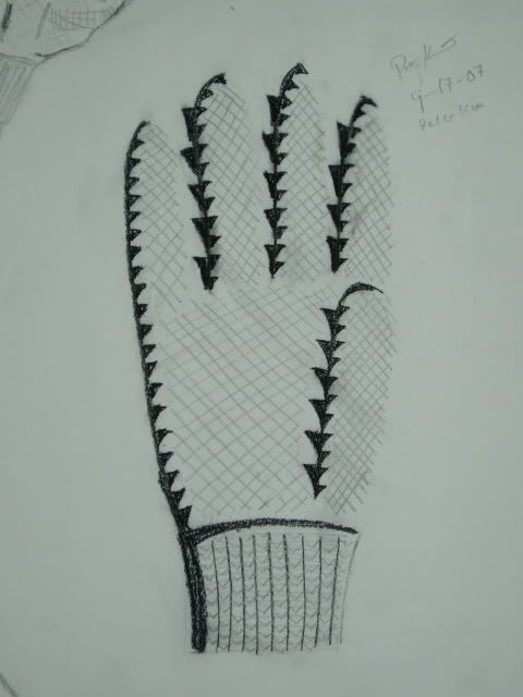
Comments, suggestions, criticisms, tips are all welcome. Completed Pieces: - Pumpkin in the Middle A still life done in acrylic paint. Complete fall 2001. - Imitation of Roy Lichtenstein 1 My first imitation of Lichtenstien. Completed Spring 2005. The beginning of my pop art phase. - Ships on a Lake An imitation of an oil painting. Because of the difference in media, the end product looks much different than what I was copying. It looks a little duller than I want it to. I might come back and patch this one up. <-- recently added Works in Progress: - Imitation of Roy Lichtenstein 2 An imitation of Roy Lichtenstein. I'm very big into pop art. Started last summer (05). <--need suggestions - Mother and Child An attempt at the famous Mary and Jesus scene. Its still a work in progress. I dont really know where I want to go with it. It doesnt feel complete to me. <--help is appreciated Sketches: - Jet Set Radio Sketch Done during senior year of high school. I was bored. A shout out to one of my favorite Dreamcast games. - Wild Arms 3 Done during the summer going into 9th grade. Summer 2001 I believe. It started out as a generic anime girl sketch but I decided to take it a different direction. - Pointilism Bird Done during senior year of high school. I was bored during calc class so I started to draw dots. Here is the end result. <-- recently added 2007 Fall Semester Portfolio Glove:
Here is one of my assignments to draw a glove in as many ways as possible. StillLife1:
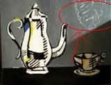
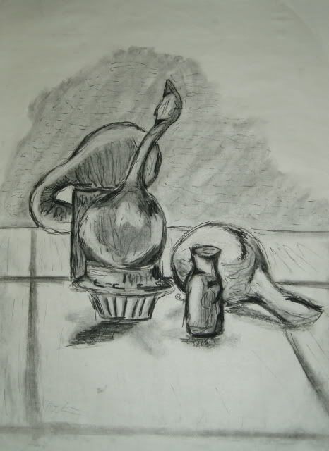
A still life. My classmates liked this one a lot... StillLife2:
...although I personally prefer the second one. Gesture Drawings:
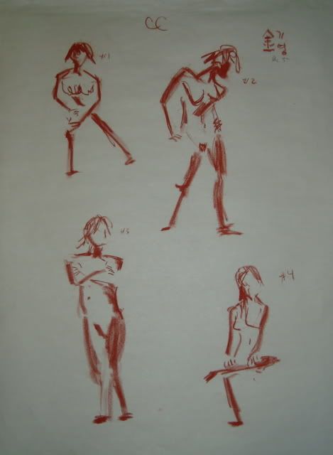
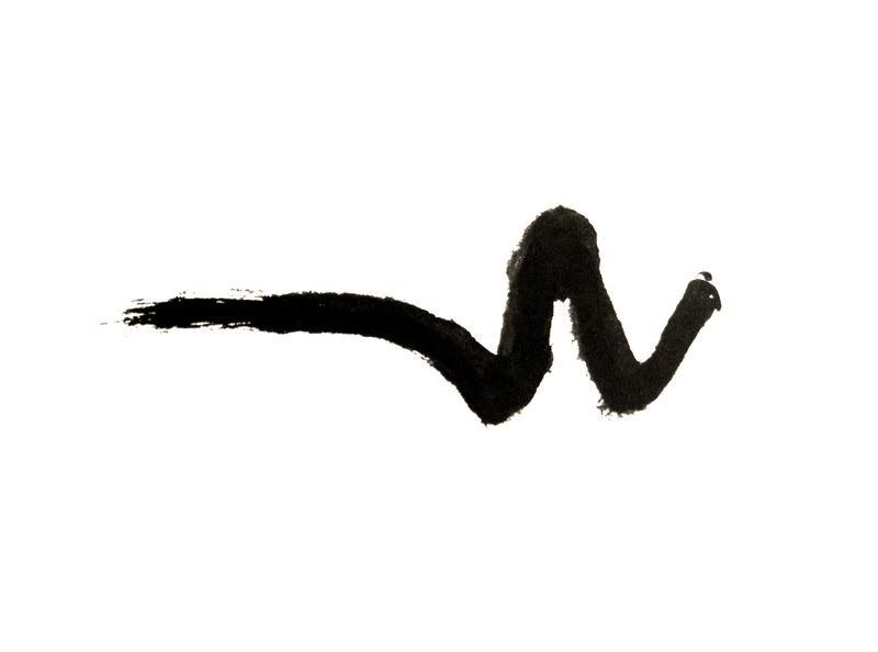
Some of my gesture drawing. My style became more minimalist as the semester went on. The red drawings are using conte crayon. More Gesture Drawings:
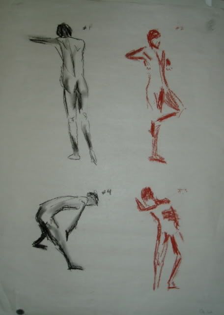
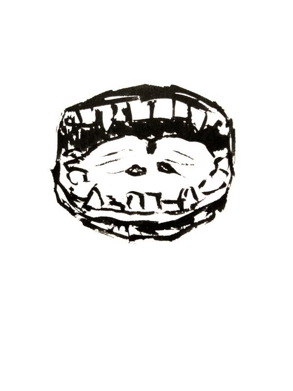
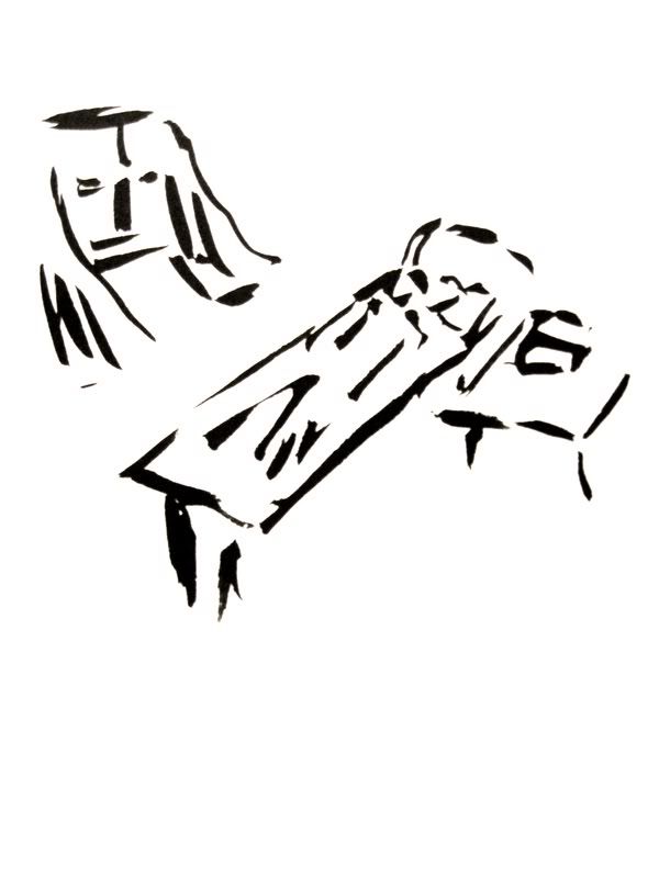
Gesture drawing from my final week of class. The drawings on the left use charcoal pencil. Face Study:
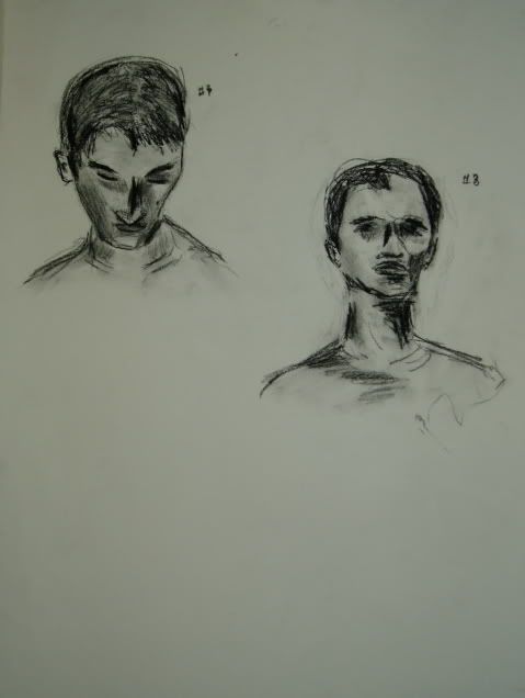
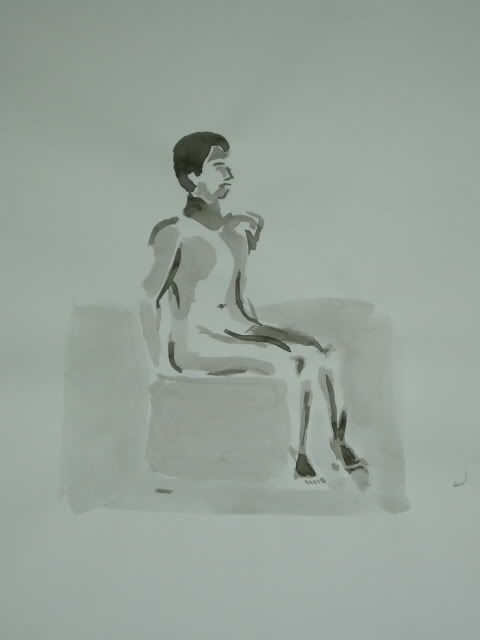
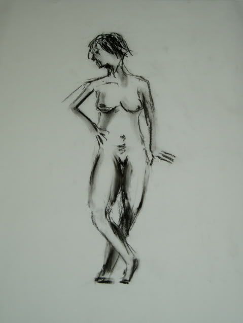
Face study in charcoal pencil. I like how this one turned out. Figure Drawing:
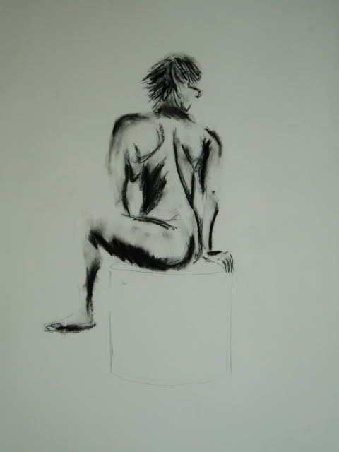
I didn't like this one much but my professor was a huge fan. More Figure Drawing:
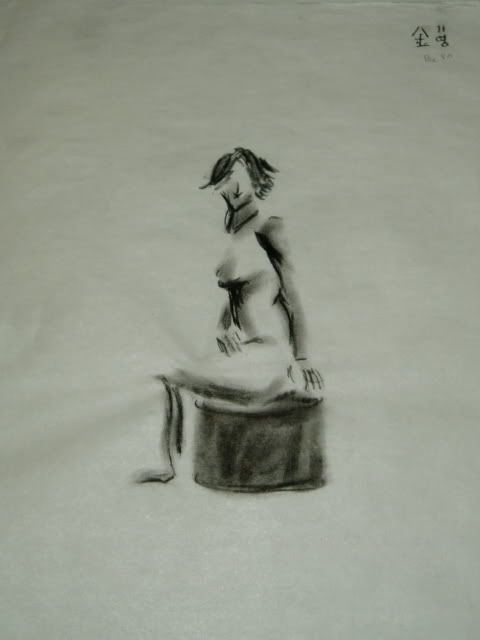
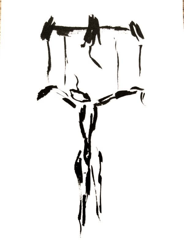
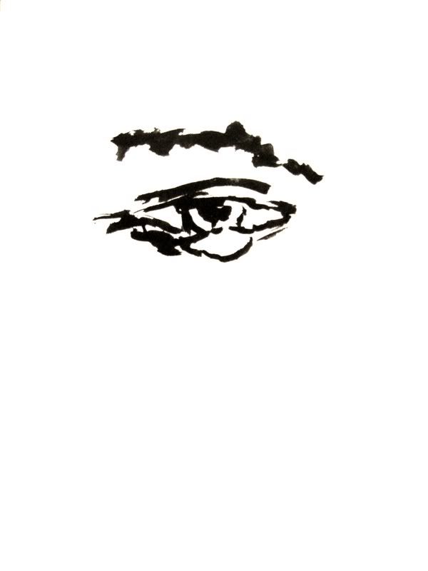
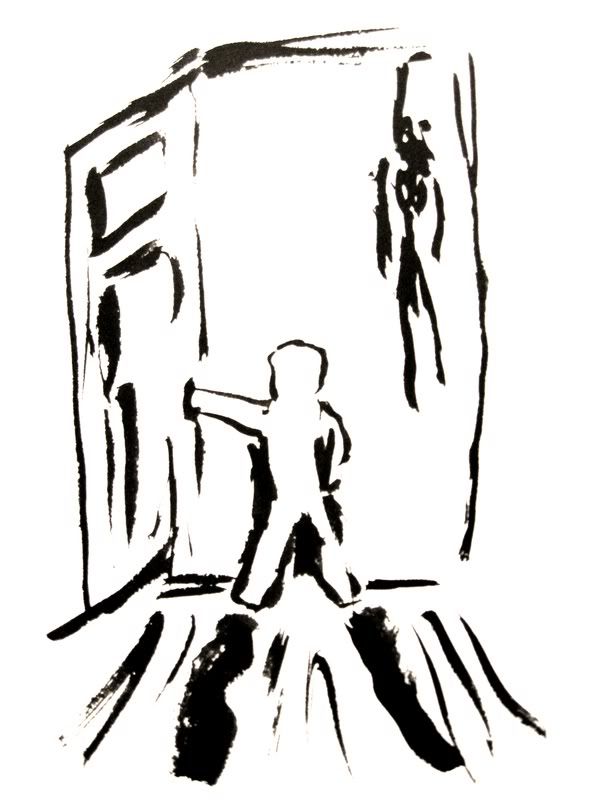
Personally, I like this one better than the previous one. India Ink1:
The next 3 are from my final week. I started using India Ink and a brush. I think I was the only one in class who eventually used ink. I like it a lot. This was my first attempt. India Ink2:
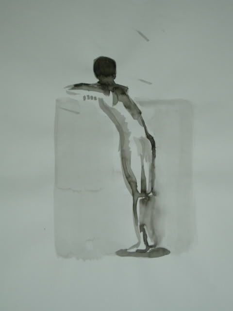
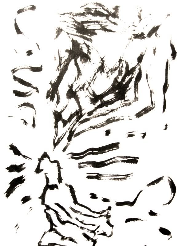
My second piece was eventually mounted for my final portfolio. Another classmate favorite although I like the next one. India Ink3:
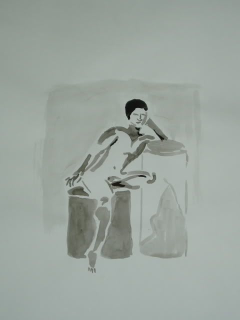
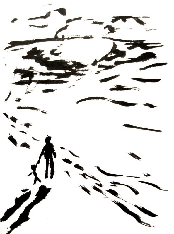
My last India Ink piece of the semester. I think I will continue working with this medium. Semester Favorite:
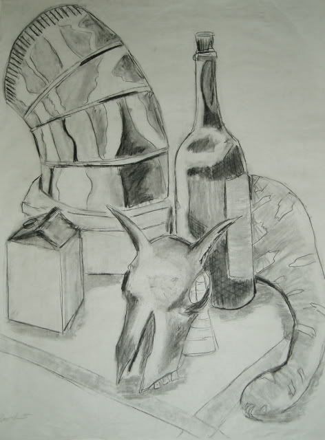
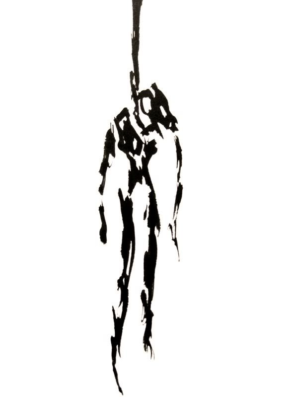
By far, my favorite piece of the semester. 2008 Spring Semester Alright. There is a whole bunch of drawings, but I'm only going to select a couple. Here they are. Spoiler:
Jam it back in, in the dark. |
Member 541 Level 26.51 Mar 2006
|
Ah... another hidden talent spring forth. >:3
My favorite is Pumpkin *in the Middle. <3 I'd actually like tighter and more close togather composition, so its easier to focuse on the primary subject. The texture you have in the background is really nice, no, its awesome. >w< I really like it. There's nowhere I can't reach. |
|
blue
Member 6459 Level 22.39 May 2006
|
I totally forgot you did art! It's like you're hiding it, though... well, not anymore.
HYDE'S COMING OUT. This thing is sticky, and I don't like it. I don't appreciate it. |
Member 929 Level 33.83 Mar 2006
|
I envy guys who can color.
It's always good to see another artist in here, good works man! Post some more. I am a dolphin, do you want me on your body? |
Member 759 Level 32.36 Mar 2006
|
Gonna go ahead and add some more. Does anyone have any feed back for my WIP? I was wondering what to put in the top right corner of the Imitation of Roy Lichtenstein 2.
 I was speaking idiomatically. |
|
Good Chocobo
Member 1774 Level 17.65 Mar 2006
|
What kind of toxic man-thing is happening now? |
Member 759 Level 32.36 Mar 2006
|
Kazyl, how about a real post >=U
I know you're artsy FELIPE NO |
|
Good Chocobo
Member 1774 Level 17.65 Mar 2006
|
Painting is beyond me dude. I wouldn't know where to begin.
The wild arms 3 sketch, I like the way you drew her. Like the shading and detail you did on the clothing. Her arms however look too curved where the right (her left) shoulder is. As for your paintings, I'm rather fond of the second Lichtenstein piece. Mainly cause it's the most simplistic. I'm all about minimalism. How ya doing, buddy? |
Member 2459 Level 7.53 Mar 2006
|
I like the Jet Set Radio sketch. I used to draw the characters all the time.
 Jam it back in, in the dark. |
Member 759 Level 32.36 Mar 2006
|
Kazyl, I was really impressed with you ink sketch in your journal earlier. Have you tried color before?
How ya doing, buddy? |
|
Good Chocobo
Member 1774 Level 17.65 Mar 2006
|
Yes... much to my dismay.
This thing is sticky, and I don't like it. I don't appreciate it. |
Good stuff, Hyde!
The first imitation of Roy Lichtenstein is my favorite, followed by the JSR sketch. By far one of the greatest DC games of all time! Coloring is actually my specialty, but I couldn't draw to save my life. I am a dolphin, do you want me on your body?  Observant Provisions | [adult swim] "Dude, this is gonna.. Man, this is gonna wicked, like, really hurt." |
Member 1354 Level 22.29 Mar 2006
|
I really like your colored pieces! They're so dramatic, for lack of a better word, especially with the bold colors and whatnot. What did you use to color the Mother and Child one? It looks like oil pastels, but of course I know pretty much nothing about this stuff. Also, I never knew you were so artsy! Great job! I really looking forward to seeing how your WIPs are coming along.
I was speaking idiomatically. |
|
Larry Oji, Super Moderator, Judge, "Dirge for the Follin" Project Director, VG Frequency Creator
Member 12931 Level 2.12 Sep 2006
|
It's really nice to see some painting here; I haven't been here long, but color/painting in general seems to be pretty rare.
Your "Pumpkin in the Middle" piece is really nice. The colors aren't dull at all, especially on the pumpkin and the background really emphasizes the pumpkin as well. My only suggestion would be to work on the blue striped table cloth. The rest of the painting has shades and highlights, and the striped table cloths stands out because it doesn't have much. Also, it's white, so your attention is drawn to that since the rest of the canvas is colored. I can see that you did put in some, but I think more might be needed, because cloth needs those shades to make it look folded and twisted. On your "Mother and Child," I think that you should work on bringing out the mother and child. Right now, they kind of blend into the woodwork since they are dark colored, and the window with the sea and the bowl of fruit on the table really stand out because they use such bright colors. I really like this dreamy feeling of the painting, and I think the "fuzziness" looks good. Don't make the mother and child too fuzzy though. Right now, it is kind of hard to see the outline of the body, and the baby. You could make the mother and child really focused and the rest really relaxed as contrast or something. These are just ideas, since you weren't sure where to go with it. If you finish this, please post it; I would love to see the end result! Keep painting Hyde! What kind of toxic man-thing is happening now? |
Member 759 Level 32.36 Mar 2006
|
Added some new stuff. Check above. Marked it in red.
FELIPE NO |
Member 759 Level 32.36 Mar 2006
|
Bump. My art thread is back!!
I'll be taking another art class next semester so I will try to update this more frequently. What, you don't want my bikini-clad body? |
Member 759 Level 32.36 Mar 2006
|
Bump. Updated. Added stuff from Spring 08
Jam it back in, in the dark. |


 THIEF
THIEF  Magi
Magi 
 Vemp
Vemp  Kazyl
Kazyl  Plarom