
 85239 85239 |
 35211 35211 |
|
|
||
|
|
|||||||
| Welcome to the Exploding Garrmondo Weiner Interactive Swiss Army Penis. |
|
GFF is a community of gaming and music enthusiasts. We have a team of dedicated moderators, constant member-organized activities, and plenty of custom features, including our unique journal system. If this is your first visit, be sure to check out the FAQ or our GFWiki. You will have to register before you can post. Membership is completely free (and gets rid of the pesky advertisement unit underneath this message).
|
 |
|
|
Thread Tools |
Member 1088 Level 32.83 Mar 2006 
|
Tutorial: How to enhance images for Avatar and Sig purposes
After posting in the Samurai Pizza Cats Avvie Sig thread , I realised that many use screencaps and sometimes magazine scans for their avatars and sigs, but most of them don't know how to enhance them. Here is my tutorial on how to enhance your Avatars and subsequently signature images.
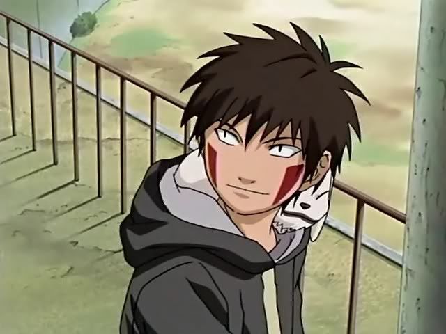
This same tutorial is also posted in my journal. If this is off topic, feel free to close it. All you need is Adobe Photoshop, mine is 7.0. And maybe MS paint. (I use it to crop images to a specific pixel) I will now use this crappy screenshot of Speedy, not from the better Tsuneko encoding of episode 1, but the crappy video quality Japanese fansubbed version I found on another site.  Looks like crap doesn't it? Don't worry, we'll fix that! First, crop it so its in the correct ratio to GFF's Avatar size, or whatever ratio you need it to be in for Sig purposes. 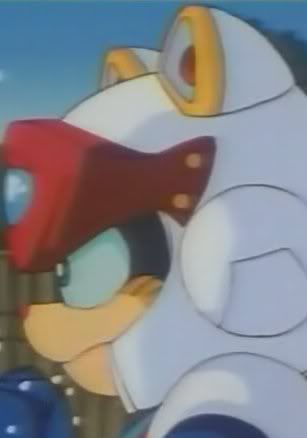 Now before we begin resizing to the actual correct resolution of 105X150, go to Filter tab>Blur>Smart Blur. Set radius 3.0, threshold around 10.1, quality low and mode normal. Then click Ok. The Threshold number may vary depending on how many "blocky bad video encode" stuff is on your image.  Smart blur helps get rid of the blocky things that pop up in a bad scan or a bad video encode. Those blocky things especially show up in an action scene from badly encoded videos. It's subtle so you may not see it in the above image, but it makes a big difference in alot of scans/screencaps I have worked on. Once that's done, you can resize it to 105X150, but I found usually if I make a huge jump from the original resolution STRAIGHT to the resolution I want, the edges of the character comes out jagged. This defintly happens when I enhance large anime artbook scans to wallpaper sizes. Jumping from 5000 ish pixels to 1280 pixels makes the image look jagged. I recommend making small jumps of 50 pixels or small % ratios a few times when resizing, since that's the way I found that will stop the jagged stuff to show up. Now your image should be something like this:  Next comes the contrast, colors and lighting. Go to Image tab>Adjustements>Brightness/Contrast. Most images I have worked with have the contrast up no further than 40. Depending on the image you have, it may be from 20 to 40. Brightness can be from around 5 to 20 depending on your image. Its all about balance, that the colors stand out, but not too high of a contrast that it ends up looking like a bad VHS tape. Brightness needs to make the image visible, without making it look like someone cranked up the TV's brightness cause she was playing Silent Hill, and now your movie's border looks grey instead of black. For Speedy here, these were the settings.  After you are satisfied with the contrast, go to Image tab>Adjustements>Hue/Saturation. Saturation can go from 10 to 30's depending on the image. The point is to saturate the colors to make it stand out even more, but not to the point where it ovesaturates and stuff like this pops out.  Big no no to the colors above. That is way too high. For Speedy here, +12 saturation should be enough. You can also adjust Hue a bit. Having it +5 or lese, or -5 or less can give it a more reddish tone or yellow tone. Play around it a bit to get the desire tone you want. The result should be like this now.  Afterwards, the colors should be alright, so its time to sharpen the image. Go to Filter tab>Sharpen>Sharpen. Then IMMEDIATLY go to Edit>Fade Sharpen. That option is right under "Step Backward". Have the opacity in "Fade Sharpen" Go down to 50%. Mode should be normal. That is how most of my images get sharpened. However, some crappy images, like the Speedy one here I am demonstrating, may actually need to be Sharpened TWICE before using the fade sharpen feature. So for Speedy it was the Filter>Sharpen>Sharpen option TWICE, then Edit>Fade sharpen, and I have the opacity at 30%. It's all about getting the right sharpness that is not jagged, but not too blurred either. Now Speedy looks like this.  Now the final step before its ready. This is a trick I learned from some LJ Icon tutorials. First, duplicate your layer. Then right click on the TOP layer and select Blending Options.  Now make sure you are in the blending options default selection. Under General Blending, change Blend Mode from Normal to Soft Light. Then have the opacity be from 30% to 50%.  This option lets the light and shadows stand out more, giving the image a bit more dimension. This trick especially works well with CG game characters, like Square's FMV character models. It makes it look more 3D. So we have now gone from this: To the final finished product:  Remember, the numbers in all the settings I have given is simply a range. It is best for each of you to watch what happens to your image and to re-adjust each setting to your own liking. Here are some more examples of what I did for my own avatars, as well as for some others. 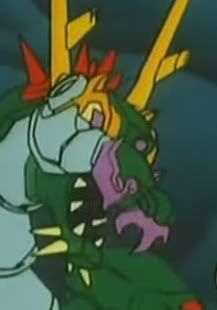   AcerBandit did this with a Falcon avatar he was working on using the same instructions I have above, which I gave him via MSN. This is his result.   So there you have it! Its pretty easy. Give it a try! Jam it back in, in the dark.  { :: ~ Air - the 1000th Summer ~ :: } :: That sea went on forever, into the blue distance :: * That road went on forever, continuing straight ahead * ~ : Summer comes again, shining silver : ~ : When I close my eyes, suddenly I can see that day's blue sky :
Last edited by Kairi Li; Aug 15, 2008 at 05:12 AM.
|
Member 28 Level 31.10 Mar 2006
|
Excellent tutorial! That Smart Blur trick is awesome, I'll definitely use that next time I make an avatar. I've always wondered how people manage to get rid of those artifacts.
The only thing I would change is instead of using the brightness/contrast sliders, I'd always use Levels (Image tab>Adjustements>Levels). The main advantage of doing that is that you get a nice visual representation of your image such as the one up there, and it's much more controllable. It also gives you a nice "shortcut" if you don't want to manually tweak any settings. Using your cropped Speedy image, here's the Levels screen:  Now you can do two things: Simply use the "white" and "black" color picker... things:  The image will automatically adjust those levels to white and black. This is usually just fine, as you can see here. But sometimes your image might not have white or black, or for any other reason you want to do it manually. In that case you can adjust the sliders:  And you can even adjust each color's levels by going under the RGB tab and choosing red/green/blue. I've never really used that though, so I don't know how that works out. I also usually use Overlay instead of Soft light on that final step, but I don't really know what the difference is, it looks like it results in pretty much the same effect. There's nowhere I can't reach.   |
Member 1088 Level 32.83 Mar 2006
|
I think overlay is a little bit stronger than soft light to me. So I used that instead.
And thanks for the levels tutorial, I tried it out once but didn't get the hang of it. This should help out alot. Also a note, not all images need to have strong saturated colors, so there are steps you can skip in the tutorial, like taking out certain ingredients from a recipe to your liking. EG Megalith's current Avatar is the Joker from Dark Knight, and I don't think anyone would wanna oversaturate the Joker. It's all about getting the right look that you want and focusing on making it look sharp like a DVD image instead of bad VHS quality. This thing is sticky, and I don't like it. I don't appreciate it. { :: ~ Air - the 1000th Summer ~ :: } :: That sea went on forever, into the blue distance :: * That road went on forever, continuing straight ahead * ~ : Summer comes again, shining silver : ~ : When I close my eyes, suddenly I can see that day's blue sky :
Last edited by Kairi Li; Aug 15, 2008 at 05:02 PM.
|
Member 23132 Level 28.40 Mar 2006
|
Since some jealous mod deleted my post, let me link my retouches again:
  I imagine that the contrast of your televisions and monitors must be torched if you tolerate blowouts like that. I am a dolphin, do you want me on your body?  |
We get it, man. Over-saturation isn't cool. I could show you some of my misadventures in that from last night that would blow your mind.
However, would you mind showing us how you adjust your levels and stuff? I'm interested. I was speaking idiomatically. 
|
 Member 11 Level 61.64 Feb 2006
|
Member 1088 Level 32.83 Mar 2006
|
With Rydia, I didn't like her original skin tone and hair color, skin looks dead and the hair looks more greyish than the green. So I changed it to my liking.
Guido looks fine though, so I'll give you that. But in the end, people make their avatars they way THEY like, not the way the rest of the world likes. There is no right or wrong way, only what you like or don't like. If someone wants me to tone down their avatar, I would do so, but don't ask me to tone down mine cause I like it the way it is. Most amazing jew boots { :: ~ Air - the 1000th Summer ~ :: } :: That sea went on forever, into the blue distance :: * That road went on forever, continuing straight ahead * ~ : Summer comes again, shining silver : ~ : When I close my eyes, suddenly I can see that day's blue sky :
Last edited by Kairi Li; Aug 15, 2008 at 06:14 PM.
|
Member 633 Level 45.75 Mar 2006
|
So I decided to give this a shot myself. This is a great tutorial.
")    Works wonderfully.  FELIPE NO |
Member 1088 Level 32.83 Mar 2006
|
Can't see the 2nd image. This is why I never use imageshack, alot of images don't show up even if they were freshly uploaded.
EDIT: Looks good Chaotic! What, you don't want my bikini-clad body? { :: ~ Air - the 1000th Summer ~ :: } :: That sea went on forever, into the blue distance :: * That road went on forever, continuing straight ahead * ~ : Summer comes again, shining silver : ~ : When I close my eyes, suddenly I can see that day's blue sky :
Last edited by Kairi Li; Aug 16, 2008 at 02:58 PM.
|
Member 633 Level 45.75 Mar 2006
|
Gonna convert that to photobucket and edit in another Kiba work I did.
[edit] Uploaded. Works pretty damn well. Definitely saving this tutorial. How ya doing, buddy? |
Member 469 Level 30.22 Mar 2006
|
I try to use the "curves" features to some extent since it filters out different brightness and contrast throughout the picture, then of course theres the downside that you could "curve" too much and mess everything up.
Nice tutorial, all of those were basic uses of photoshop but simple enough for anyone to use.   There's nowhere I can't reach. |


 Kairi Li
  surasshu
  FatsDomino
  Chaotic